Which Typeface Should I Use and When?
Typeface vs Font- what’s the difference?
The main different between these terms is “typeface” is the name of a collection of related fonts and “font” refers to a specific width, weight and style within that typeface.
Does it really matter? Not really, the terms are often used interchangeably and it doesn’t present any problems.
Similar to color, different typefaces evoke different emotions from their audience. It’s important to understand each typeface style and make sure you’re choosing a font that aligns with the personality of your brand and the message you want your brand to communicate.
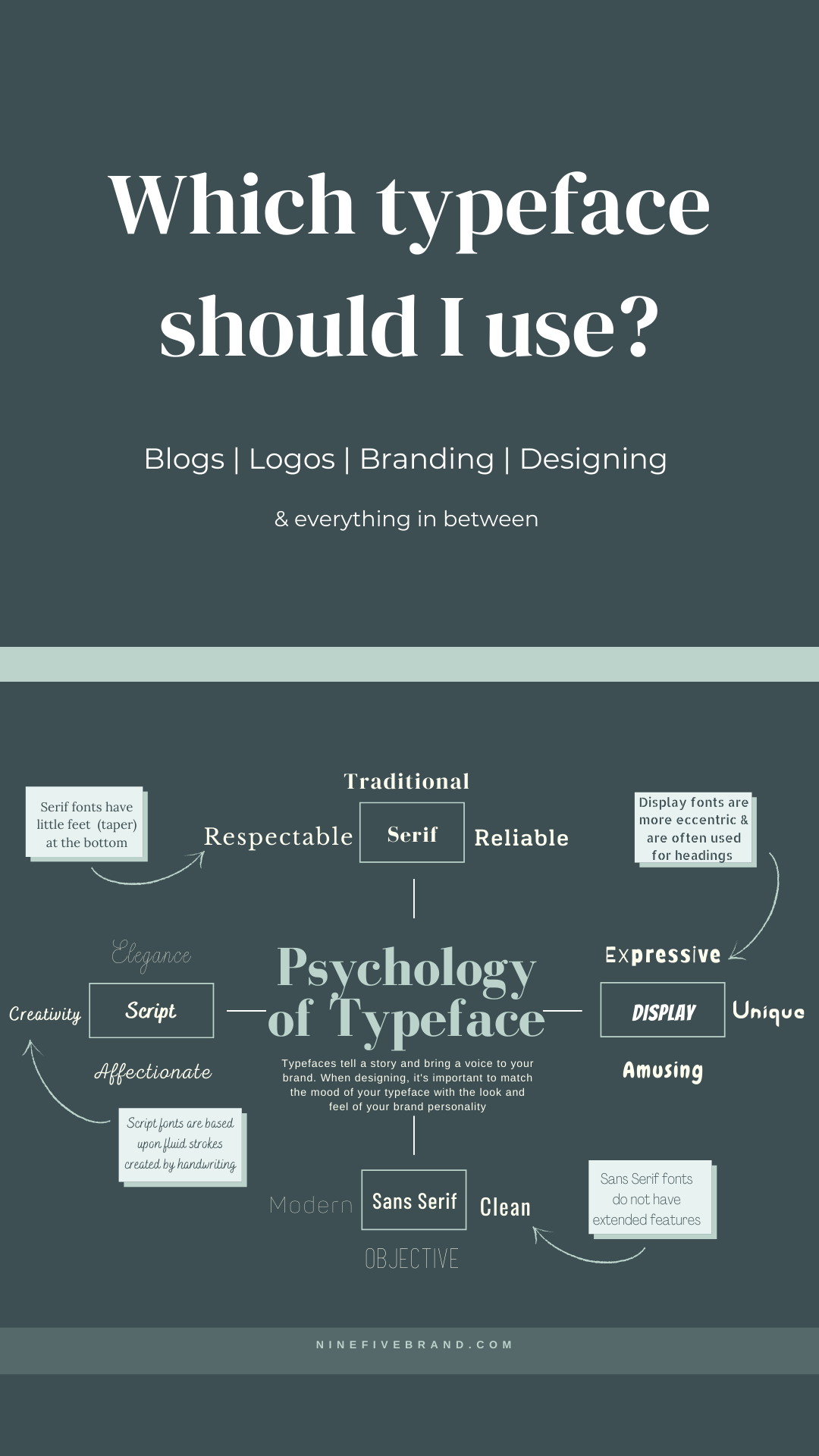
Serif
A serif is a stroke that finishes off the end of a letter (sometimes called “feet” or “taper”) Old Style serif fonts date back to the 15th century and are widely used throughout history. They are often used in newspapers & books, which creates a feeling of tradition and professionalism.
When should I use a serif font?
In most cases, serifs aid in the readability of a font, so they can be used at a large or small point size. Because of this, serif fonts are widely used as headers and/or paragraphs across blogs, websites, and brand designs. They are often used in newspapers & books.
What does a serif font say about my brand?
When using serif fonts in a brand logo, your brand will emit a traditional feel. Your logo will display your brand as being reliable & respectable. Serif fonts are often used for professional businesses such as law firms, insurance agencies, editorial, etc.

Sans Serif
Sans serif fonts are recognized by having crisp, clean lines often with sharp edges. Sans serif fonts are on the rise today and are popular for digital design & media due to their on-screen clarity.
When should I use a sans serif font?
Similar to serif, sans serif fonts have been known to be easily readable at a small point scale. Which makes this font popularly used on a webpage as paragraphs, links, and other small text areas such as a sidebar.
What does sans serif say about my brand?
Sans Serif fonts are seen as modern, edgy, and even youthful. Early brands that used sans serif logos included technology & medicine which has created a feeling of futuristic and clean.

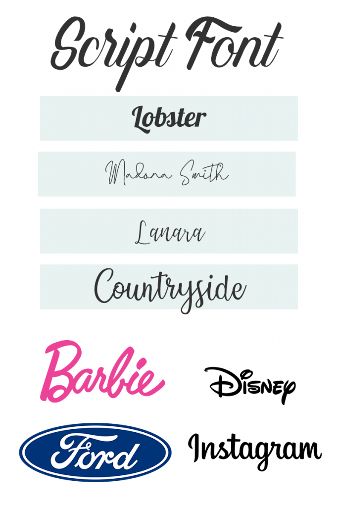
Script
Script fonts mimic cursive handwriting and are recognized by having curls and flourishes beyond the serif. There are formal and casual script fonts that create a feeling of sophistication and elegance.
When should I use script font?
Due to the ornate nature of script fonts, they are best used sparingly. Script fonts are great for logo accents and attention-grabbing headlines on blogs & web pages.
What does script font say about my brand?
Choosing a script font in your brand design can say many different things about your brand personality. Formal script font can be viewed as elegant, while casual script can be personable and creative.
Display
Display fonts, unlike other typefaces, have a more eccentric design. They have been used for posters and bold designs to attract customers.
When should I use display font?
Display typeface is intended for use at a larger point size so they are best used for headings. Due to display fonts bein ununified, they are not clear enough for paragraphs and similar copy.
What does display font say about my brand?
Display fonts are edgy and more aggressive than other typefaces. Brands choosing display type fonts in their logo and branding are seen as informal, unique, expressive.

Pro tips:
- Don’t mix too many fonts together– Combining more than 2 different typefaces in one design can be distracting and difficult to read
- Design logos & submarks accordingly– In addition to your brand logo, you need a submark that compliments your logo. This submark is to be used as a substitute for anytime you need your logo to be displayed on a small scale, ex: social media icons
- Carefully pair typography and color– Use color and typography together to create clear & defining brand designs
- Use your font throughout your branding– Continue to use the font from your logo throughout your brand designs, blog, and social posts